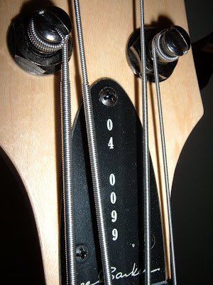
The new purple abalone knobs came from Qparts (q-parts.com) with the express intention of doing a quick and subtle upgrade to #99, Ginner, described in an earlier post.
The knobs are labeled "black" but I knew that it was not the coal black, but the silver black they were describing, and that matches exactly the tuning machines on Ginner.
But alas the knobs were too big, too much girth.
Tim, my business neighbor, guitar player and laser genius, took a look at my quandary and said, "Brass, sure, I can do that!" and in about 20 minutes he had all three turned down on his little mill (see illustration). That shoulder allows the knobs to fit into the counterbore that is one of the hallmarks of our design.
I took a picture precisely 1/3 through the installation so you can see the difference between the two knob designs.
It is reasonable to explore the possibility that the new ones do not protrude enough for rapid deployment. I'll know in a week or two. Because of the Stellartone retrofit, the pot shafts middle and lower are shorter, so the knobs sit down in the counterbores a bit more than the stock knobs, which are taller to boot. As a result, the top pot has to be lowered in the cavity a little bit--requiring an extra nut and washer. If your B1 is stock, it will need three extra nuts and washers (which I can furnish for you).
Meantime I am feeling like a 50's kid (and I am one) that just got a new set of hubcaps for his '51 Shoebox Ford DeLuxe Coupe with torched springs in front and Fingerhut seat covers. (I don't have one.)
One note if you choose to go this way: the knobs are packaged individually. Of my three, one was in perfect condition but the other two were abraded on the abalone surface. They had a dull, not shiny look. I noticed this too late, and rather than return them I had to fix them. About a half hour with Micro-Mesh abrasives and a little water, and all three shine like the sun off a just-thawed pond on a late winter morning.
In retrospect, it's just a little gift I gave myself. Excuse me, I've got to go write a thank you note now...
Monday, December 29, 2008
Friday, December 19, 2008
Dignity
It started with a regular citizen who knew our town had a fairly new city commission charged with placing art in public places and all that surrounds that.
At the outset, that commission spent nearly a year creating its own policies and procedures and then set itself to its mission: enhancing the lives of Redmond citizens via the addition of art that all can share.
The first two works can be seen at www.gregcongleton.com . Click on "installations" and then eagle and the cowboy. They're called "Air Traffic Control" and "Western Swing." Greg is a longtime friend--his family and mine were in the same babysitting coop nearly 30 years ago--and his art is powerful on a number of levels. Enjoy a tour of Greg's work.
A few weeks ago, in a lovely ceremony on a warm early winter day, a crowd gathered to unveil the art commission's latest triumph: a bronze called "Dignity." Pictures attached.
Rodd Ambroson grew up in our town. His journey to art is beautifully written on his web site: http://www.roddambroson.com/index.html where you can see the range of his work.
Back to the citizen mentioned at the beginning of this: Bob Vancil was aware of Rodd's work and suggested it to a member of the commission. From that beginning came the reality of this expressive artistic statement gracing the entrance to the Redmond Chamber of Commerce and Economic Development offices. It could be your first impression of Redmond.
In his remarks at the unveiling, Rodd said she reminds us to "dress up, show up, and do the next right thing." Let it be an inspiration to us to find our own road to dignity. Wonderful things will happen and all will benefit.
Labels:
art installations,
bronze,
Greg Congleton,
public art,
Rodd Ambroson
Friday, December 12, 2008
Stellartone Tonestyler Revisited, and Hello to Ginner
Back in October, 28th to be precise, I said "in a week" I'd post pictures of this bass. It's been a long week, but here they are. #99. Called "Ginner."
Since completing this assembly and setup, I have played this bass twice weekly at church.
Something's new there: Little post-its on my music that say things like B-4 or M-0 or N-1.
They're reminders to roll to the bridge or neck pickup or the center detent which is both. This is the middle knob.
The lower knob is the Tonestyler. The numbers in my top secret alphanumeric code refer to clicks from the most bass position, which would correspond to "off" on a volume knob. (The top knob is a master volume.)
The amp stays set the same, no preamp fiddling, no foot pedals, just click and go. Sounds sort of like some kind of kitchen floor cleaning gizmo, but it's not. It's an astounding upgrade to a Barker Bass.
A word about Ginner. I had targeted that bass to be my own from the beginning. There was a flaw in the body--not easy to find, but I knew where it was. It couldn't go out the door as a typical representative of the marque, so it stayed around, its future marked boldly: "For Lee."
One year at NAMM we met some delightful men from China who were vending instrument hardware. They were our neighbors across the aisle. We became friends, and they were intrigued with the Barker Bass. On our last day there, they insisted I take a set of their tuning machines. I graciously accepted, out of a sense of diplomacy as well as professional curiosity about less expensive instrument hardware. The machines went into the same figurative drawer as the marked body.
And there was that endpin that Rod, my welder (really, that's his name) missed--the plate a little askew from the shaft.
And Stew at Nordstrand had been gently reminding me that he thought a set of split coils would sound really good in a Barker. I bit on that one. More in the drawer.
And there was this orphan neck. It was not quite "right" but I knew that I could make it work for me.
It looked like an ideal platform for testing the Stellartone.
In fact, I could test the Tonestyler on any Barker B1--it leaves no marks or scars--but I was convinced, from Will Witt's experience with his B1-5 and my playing the Brio here, that this was going to be right down my teacup.
I like it a lot. Ginner will be around a long time.
She's named after my mother, who died in mid October. Mom survived the Depression by getting by. She was a saver: "You never know when you might need one of these..." She was genius at making do. She would appreciate that I built in her honor not a perfect, top-o'-the-line bass, but one characterized by the triumph of using what's at hand. #99. Unique. Of humble origins. Stands tall.
Wednesday, December 10, 2008
Unretouched Photos
Tuesday, December 2, 2008
Words And Their Intrinsic Artisticossity
That's a Wordle. I did it here: http://www.wordle.net/ It's Linda's fault, she's the one who put me on to pasting a block of text and then tweaking it to make it art. I selected stuff from the Jaguar Amplifiers web site. How does it strike you? Does it stand on its own art feet? Does it additionally pull you into to some ideas, some concepts, that speak not to the other, but to the original object of the text?
I love words. I got that from my dad, who was born the son of a printer, became one himself, working for years both full time and part time as a Linotype operator in the days of pots of hot lead. That alone would not necessarily facilitate the leap to wordsmithing, so perhaps his dad, who did considerable writing, fostered the passion.
(I must inject this: In the latest Wireless catalog, the vendor of cuteness to the Public Broadcasting Fans of the World, there's a shirt that reads, "I'm a Wordsmith, which is like Blacksmith, only without the tools and fire and stuff.")
I have always enjoyed the attempt to find the right words, and the music in them, but I never spent much time ogling letters in combination. Linda, however, the Mrs. Barker of Barker Musical Instruments, is a self taught graphic artist who gets excited about typefaces.
She created the B logo for the Barker Bass, and is responsible for much of our print stuff.
Now I can't write something without wondering what typeface ought to be used. And I admire the results when someone else nails it.
Henry Clift is the powerhouse behind Jaguar Amplifiers. He's the persistent type, with the 1% inspiration, 99% perspiration ratio hardwired into his genes. He starts with an idea and proceeds doggedly until it is realized.
You can read the story on the Jaguar Amplification web site, http://www.jaguaramplification.com/index.html
I like the way his bass amp sounds. My oh my. And I like the way those typefaces look.
And on top of that, his story is Wordle-Worthy.
(To see that Wordle in a bigly way, just click on it!)
Labels:
Amplification,
Henry Clift,
Jaguar,
Typefaces,
Wordle
Subscribe to:
Posts (Atom)